Figures 

 are the most important tool for communicating results in a slide deck, and one of the key tools in a paper.
Here's a tweetorial for #EconTwitter on how to create effective figures in @Stata. Illustrated with examples from my JMP. <thread> https://michaelstepner.com/jmp/


 are the most important tool for communicating results in a slide deck, and one of the key tools in a paper.
Here's a tweetorial for #EconTwitter on how to create effective figures in @Stata. Illustrated with examples from my JMP. <thread> https://michaelstepner.com/jmp/
Creating effective figures takes only two steps!!
1. Pick good defaults
2. Question all the defaults
The question to ask yourself: How do I get my message across, with a minimum amount of effort from the reader?
The knows your data, but it doesn't know your message. 2/11
1. Pick good defaults
2. Question all the defaults

The question to ask yourself: How do I get my message across, with a minimum amount of effort from the reader?
The
 knows your data, but it doesn't know your message. 2/11
This tweetorial is a series of examples of the graph parameters that I find especially useful to customize.
Today I'll tweet about (1) Defaults. I'll continue this week with threads about: (2) Legends & Labels. (3) Axes. (4) Color. (5) Titles. 3/11
Today I'll tweet about (1) Defaults. I'll continue this week with threads about: (2) Legends & Labels. (3) Axes. (4) Color. (5) Titles. 3/11
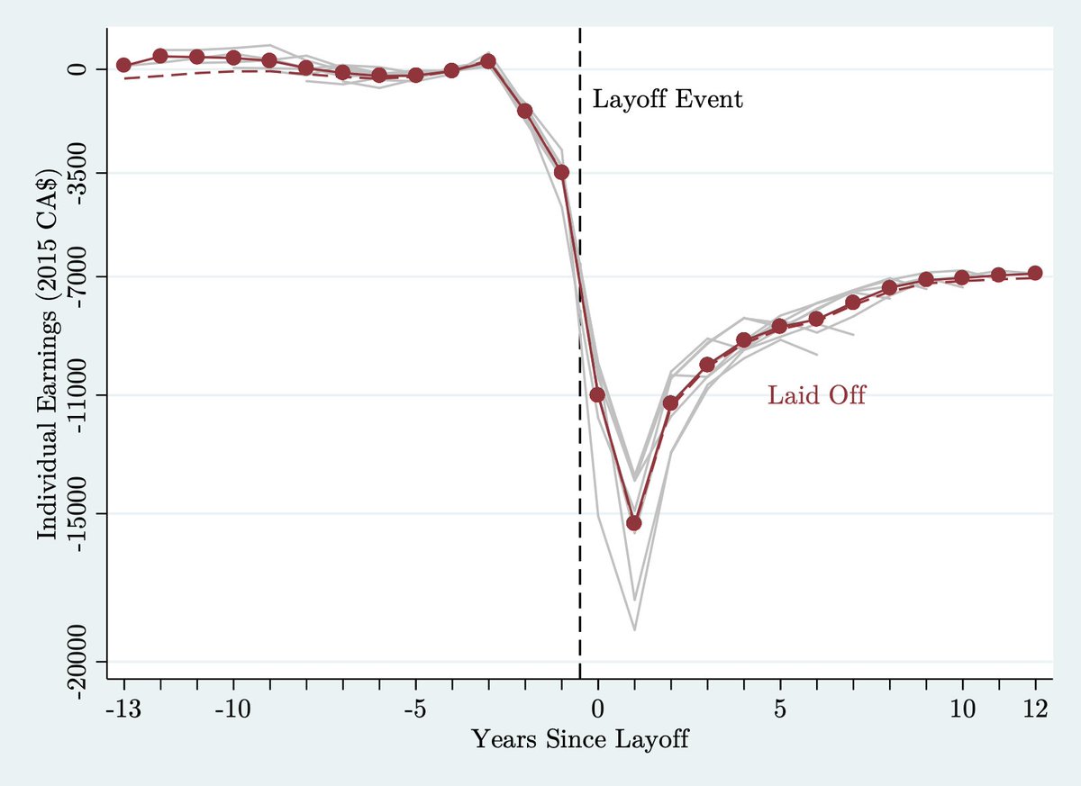
Let's begin with the easiest step: pick good defaults. Does anyone how long Stata's default graph style has gone unchanged? I don't...but it's old and it's not great 
Lots of schemes are great! My favorite is this one by my friend Mike Droste: https://github.com/mdroste/stata-scheme-modern 4/11

Lots of schemes are great! My favorite is this one by my friend Mike Droste: https://github.com/mdroste/stata-scheme-modern 4/11
Changing the default graphic style is as easy as "set scheme <scheme_name>, perm".
What makes a good default? I'd say: maximizing signal and minimizing noise. The 'modern' scheme does so with:
- No blue backgrounds
- Horizontal y-axis text. No one likes tilting their head!
5/11
What makes a good default? I'd say: maximizing signal and minimizing noise. The 'modern' scheme does so with:
- No blue backgrounds
- Horizontal y-axis text. No one likes tilting their head!
5/11
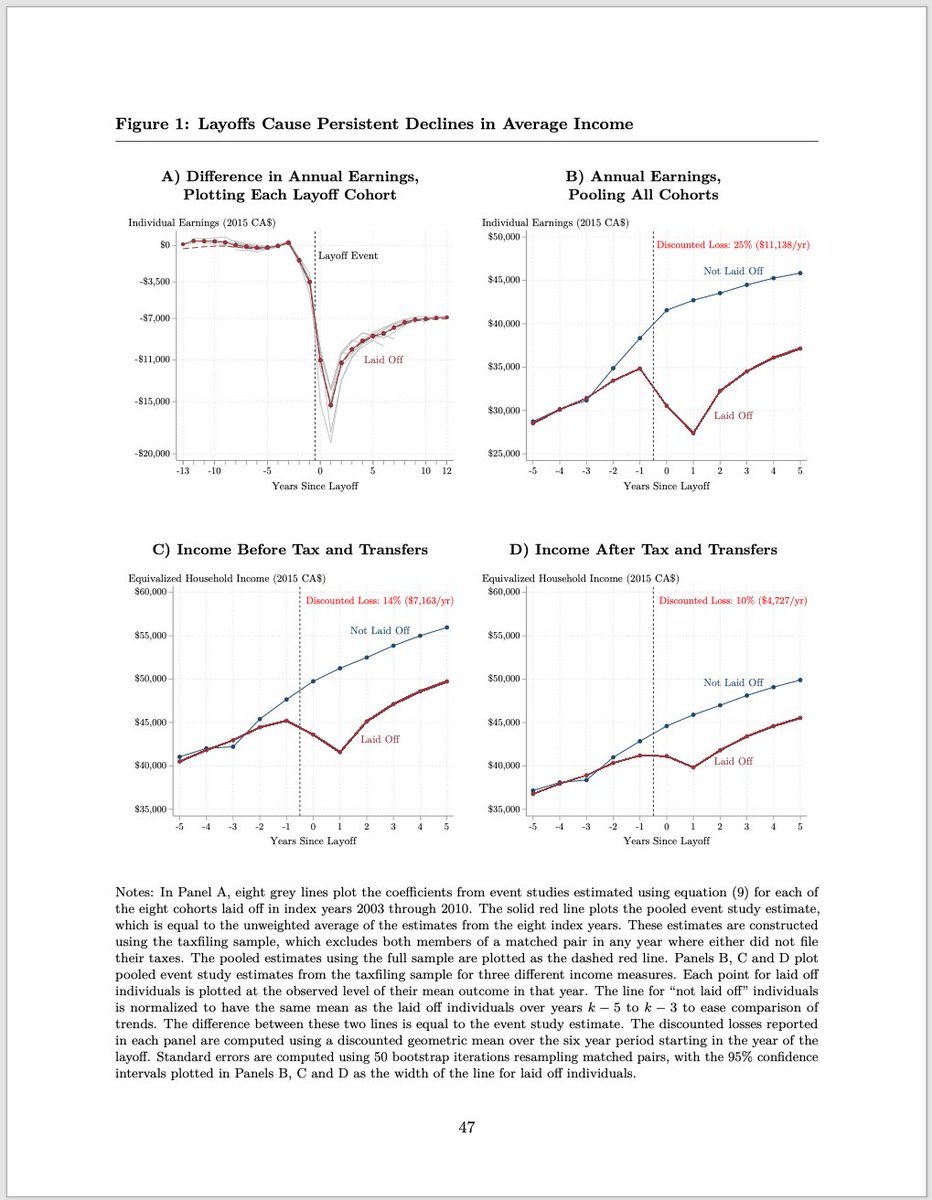
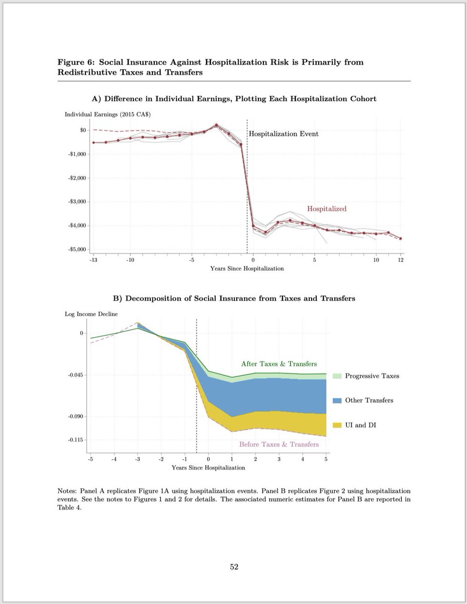
Once you've chosen good defaults, the real work begins. No defaults are perfect for all figures. A typical paper has <10 figures: each one deserves some customization to be as effective as possible.
A good starting point is choosing the dimensions of the figure... 6/11
A good starting point is choosing the dimensions of the figure... 6/11
Putting 4 panels on a page? You can maximize the size of the figures squaring them up. I like to add `xsize(4.6)`.
Putting 2 panels on a page? Or 1 panel on a widescreen slide, because you've listened to @paulgp's 16:9 slide gospel? Use all your horizontal space: `xsize(8)`
7/11
Putting 2 panels on a page? Or 1 panel on a widescreen slide, because you've listened to @paulgp's 16:9 slide gospel? Use all your horizontal space: `xsize(8)`
7/11
Plotting a 45-degree line? Why not help your audience out and make that guy actually 45 degrees! (example from another project)
Yes, readers can read the legend. But if your 45-degree line looks the part, it reduces the time and effort required to understand the figure. 8/11
Yes, readers can read the legend. But if your 45-degree line looks the part, it reduces the time and effort required to understand the figure. 8/11
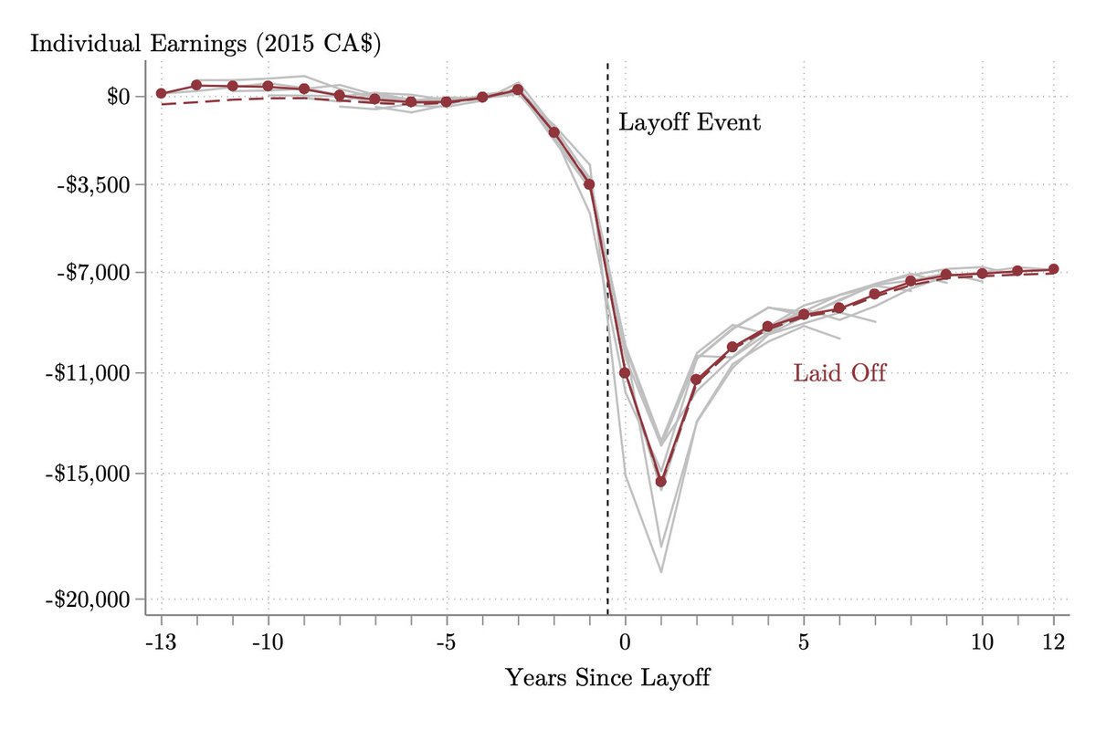
Here's a minute optimization that pleases the eye: you can match the font in your figures  to the font in your paper
  or your slides.
Which looks better to you? 9/11
 to the font in your paper
  or your slides.
Which looks better to you? 9/11
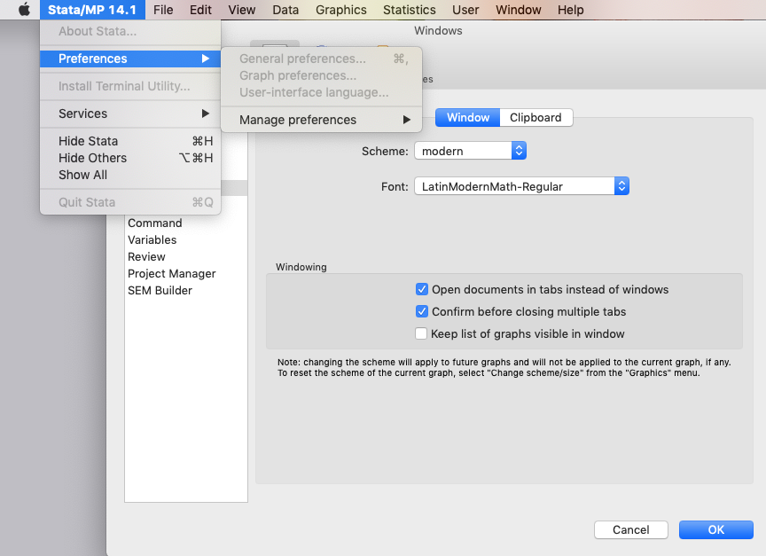
To change the fonts of your Stata graphs to match the default font in a LaTeX paper:
1. Download and install the Latin Modern Roman font on your computer: https://www.fontsquirrel.com/fonts/Latin-Modern-Roman
2. Change the font in under Stata's "Graph Preferences" (see attached screenshot for OS X)
10/11
1. Download and install the Latin Modern Roman font on your computer: https://www.fontsquirrel.com/fonts/Latin-Modern-Roman
2. Change the font in under Stata's "Graph Preferences" (see attached screenshot for OS X)
10/11
That's it for this thread on choosing and customizing defaults to make effective figures in Stata.
Tomorrow I'll tweet about Legends & Labels. I'll finish off the tweetorial with threads about (3) Axes. (4) Color. (5) Titles. I'll add links to each follow-up thread below. <end>
Tomorrow I'll tweet about Legends & Labels. I'll finish off the tweetorial with threads about (3) Axes. (4) Color. (5) Titles. I'll add links to each follow-up thread below. <end>
Part 2 on designing effective Legends & Labels continues here: https://twitter.com/michaelstepner/status/1201928941151424512

 Read on Twitter