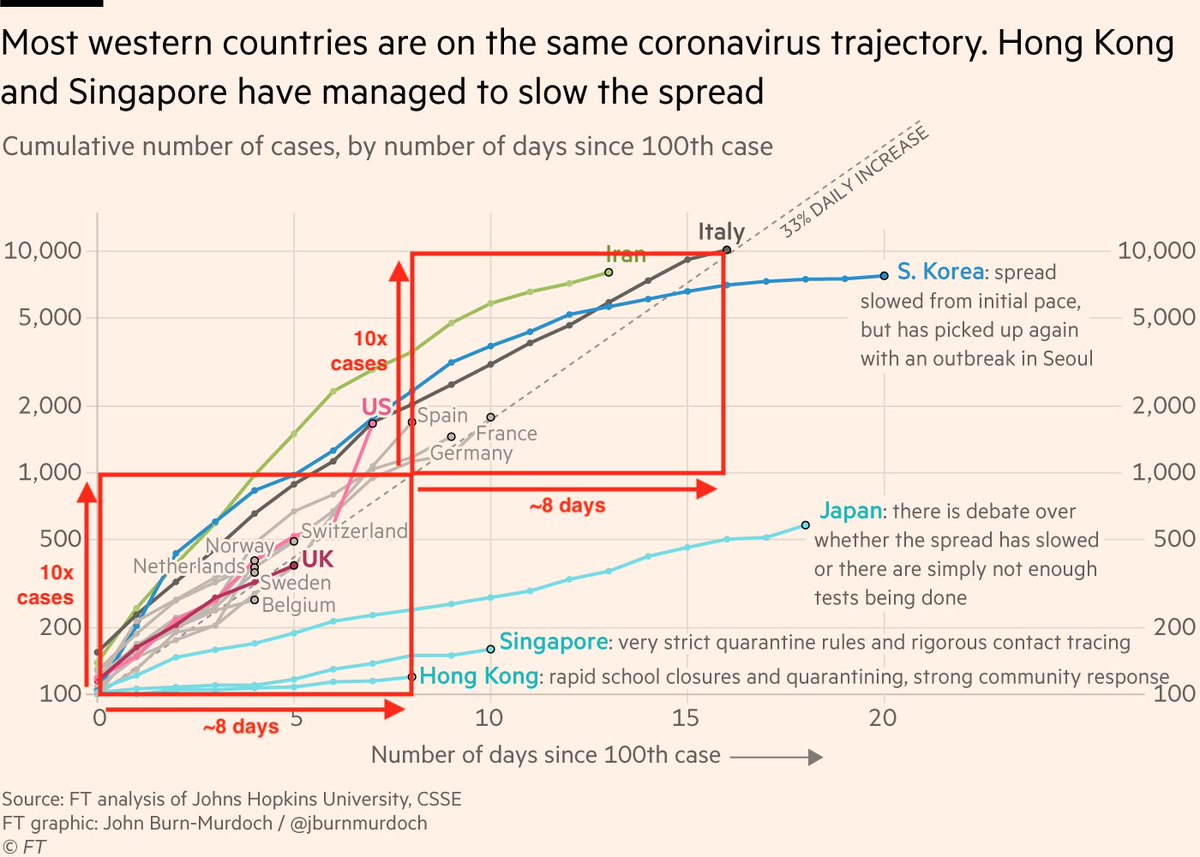
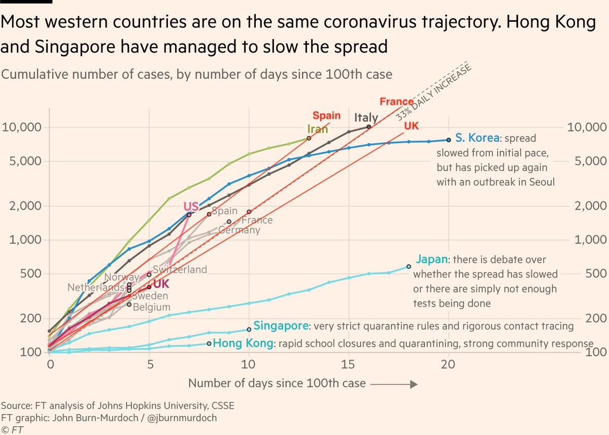
I’m no epidemiologist, but I am a #dataviz specialist, so here are some thoughts on coronavirus and log scales:
1) In the initial outbreak phase, a virus like this spreads exponentially not arithmetically, i.e a log scale is the natural way to track the spread https://twitter.com/jburnmurdoch/status/1237737352879112194
1) In the initial outbreak phase, a virus like this spreads exponentially not arithmetically, i.e a log scale is the natural way to track the spread https://twitter.com/jburnmurdoch/status/1237737352879112194
2) If we show case numbers on a linear scale, it would look like UK, US etc have little to worry about: they’re down here and Italy is way up there! You’d also be asking readers to calculate an exponential curve in their head to see if two countries are on the same trajectory ???
3) Log scales handle all of this:
First, vertical distance represents multiplicative difference. The space between countries with 100 and 1,000 cases is the same as that between countries with 1,000 and 10k, because it takes the same time to go between those two milestones.
First, vertical distance represents multiplicative difference. The space between countries with 100 and 1,000 cases is the same as that between countries with 1,000 and 10k, because it takes the same time to go between those two milestones.
4) And second, readers now only have to draw a straight line in their head to see if two countries are one the same path 


5) imo much concern over "reader don’t understand log scales" is misplaced.
When a reader ponders this chart, they’re asking "are these two countries on the same course", or "how many days til country X is at Y cases", not "how many pixels represent 100 cases" etc.
When a reader ponders this chart, they’re asking "are these two countries on the same course", or "how many days til country X is at Y cases", not "how many pixels represent 100 cases" etc.
6/6 A chart should convey a message and allow people to answer useful, real-world questions about real-world phenomena [like exponential growth]
The log scale version of this chart does that, where the linear scale version would be a) less useful and b) more panic-inducing
Fin.
The log scale version of this chart does that, where the linear scale version would be a) less useful and b) more panic-inducing
Fin.

 Read on Twitter


