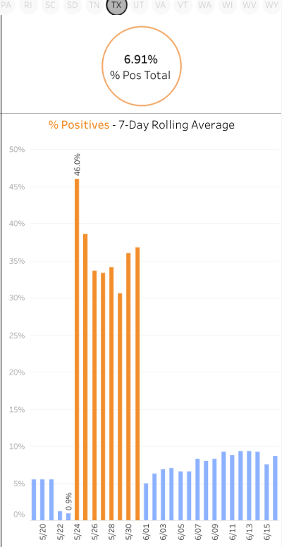
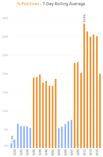
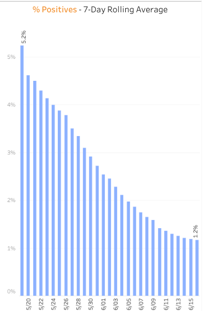
For instance, this is what the Texas data looks like. This is a data dump or mass test spike, this is not increased spread. https://twitter.com/kylamb8/status/1273346923467071488
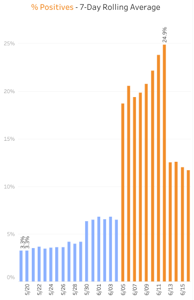
Does South Carolina look natural to you? In the span of one day, it jumps from 6% positive to 19-24% for a week then mysteriously gets cut in half again...
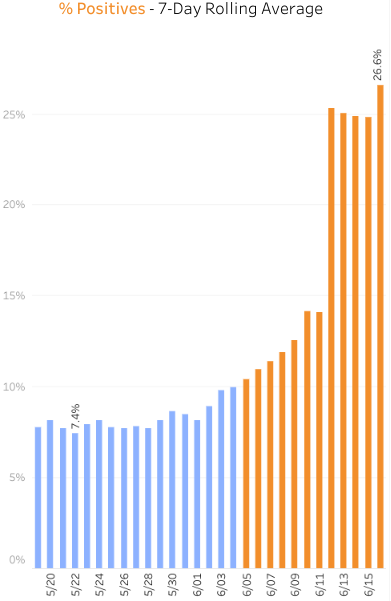
You could argue that Arizona was seeing a little increase (without knowing the context of why, as there may have been other explanations), but then on June 12, the positive percentage nearly doubles for the last several days. That's also a sign of mass testing/data dump
Now compare these to New York, for instance. This is what *authentic* increase or decrease looks like. A gradual curve, not exponential spikes in one day increments.

 Read on Twitter