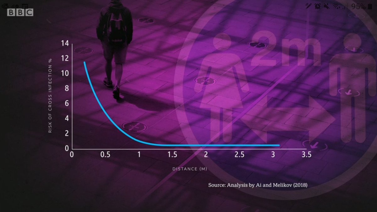
Yesterday's #Newsnight used this plot to argue that 1m #coronavirus distance is enough. Maybe it is, but I don't think this plot shows it. Two obvious points: (1/5)
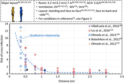
1. The curve actually shows that the risk at 1m is roughly twice as high as at 2m. The source (Ai and Melikov, 2018) seems to be this review. The data at >1m is mainly from Liu at al 2016. (2/5)
https://onlinelibrary.wiley.com/doi/full/10.1111/ina.12465#
https://onlinelibrary.wiley.com/doi/full/10.1111/ina.12465#
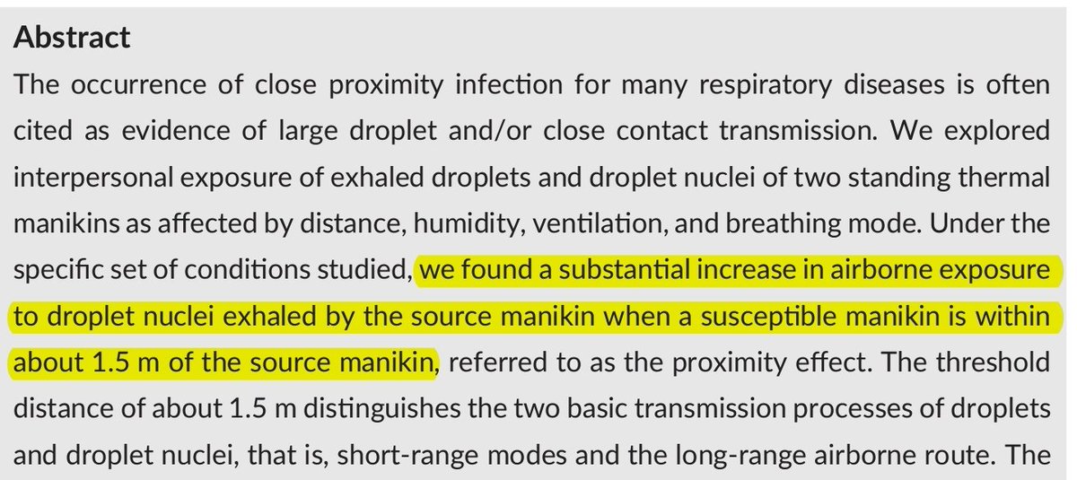
That is this paper. Indeed, they find that 1.5m is the range of the short-range transmission mode. Therefore I am not sure where the #Newsnight 1m came from. (3/5)
https://onlinelibrary.wiley.com/doi/10.1111/ina.12314
https://onlinelibrary.wiley.com/doi/10.1111/ina.12314
2. The normalisation of the y axis. Newsnight labels it as % risk, but the risk depends on the time of exposure. What is, therefore, the actual acceptable risk threshold for schools where kids spend 6 hours in the same room? Is it really in that small gap between 1m and 2m? (4/5)
I should clarify that I am not saying 1m is not safe. I am not an expert in this. I just want someone to convince me that 1m is safe, and the #Newsnight plot did not do that. (5/5)

 Read on Twitter


