 How does Ontario compare to Florida when it comes to COVID-19?
 Is Rt over 1.0 “bad”?
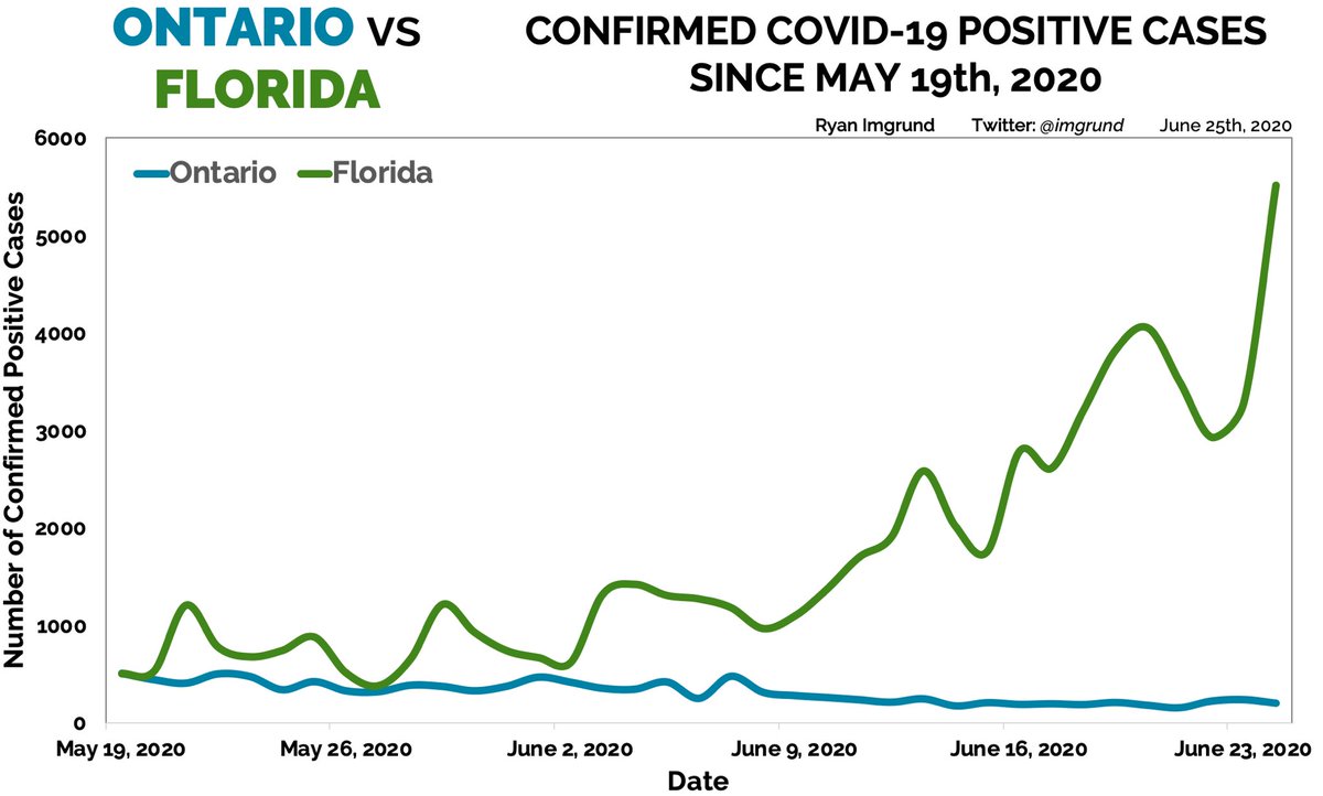
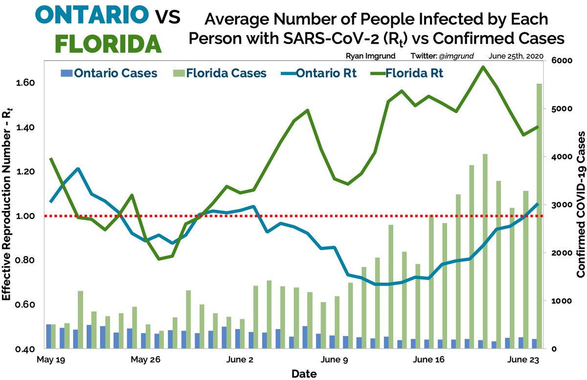
Both places released EXACTLY 502 cases on May 19th. Since then? SEE BELOW. Could we have predicted this?
 A TALE OF TWO PLACES. A THREAD.
... by a HOSPITAL BIOSTATISTICIAN

...1/6

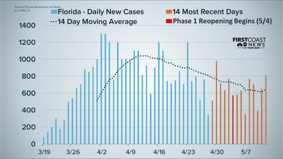
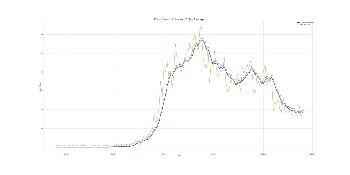
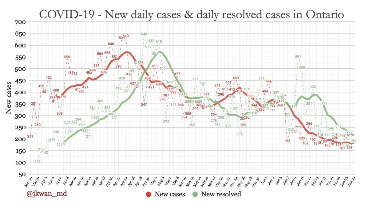
The Florida case count graph from May 14th looks IDENTICAL to the Ontario one from today, June 25th.
For comparison, I attached Florida’s from May 14th as well as today’s graphs from @jkwan_md and @salvella.
But could we have predicted Florida’s decline?
KEEP READING.
...2/6
For comparison, I attached Florida’s from May 14th as well as today’s graphs from @jkwan_md and @salvella.
But could we have predicted Florida’s decline?
KEEP READING.
...2/6
DAMN RIGHT we could’ve predicted Florida’s decline!
This is where Rt comes in.
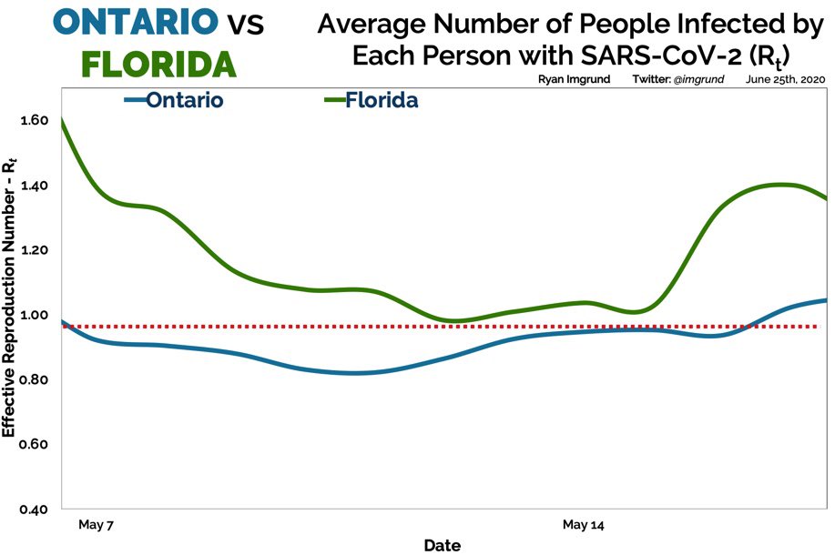
On May 7th and May 17th, Florida’s Rt was at 1.40; Ontario was 0.92 and 1.02. Between these dates, we remained lower. The difference appears small but that’s far from the truth.
KEEP READING
...3/6
This is where Rt comes in.
On May 7th and May 17th, Florida’s Rt was at 1.40; Ontario was 0.92 and 1.02. Between these dates, we remained lower. The difference appears small but that’s far from the truth.
KEEP READING
...3/6
The damage after May 19th was already done with Florida’s heightened Rt PRECEDING May 19th. For the next two weeks, the Rt’s were quite similar for Florida and Ontario.
But on May 31st...Florida was at 739 cases per day, Ontario at 372.
 Then came June.
KEEP READING
...4/6
But on May 31st...Florida was at 739 cases per day, Ontario at 372.
 Then came June.
KEEP READING
...4/6
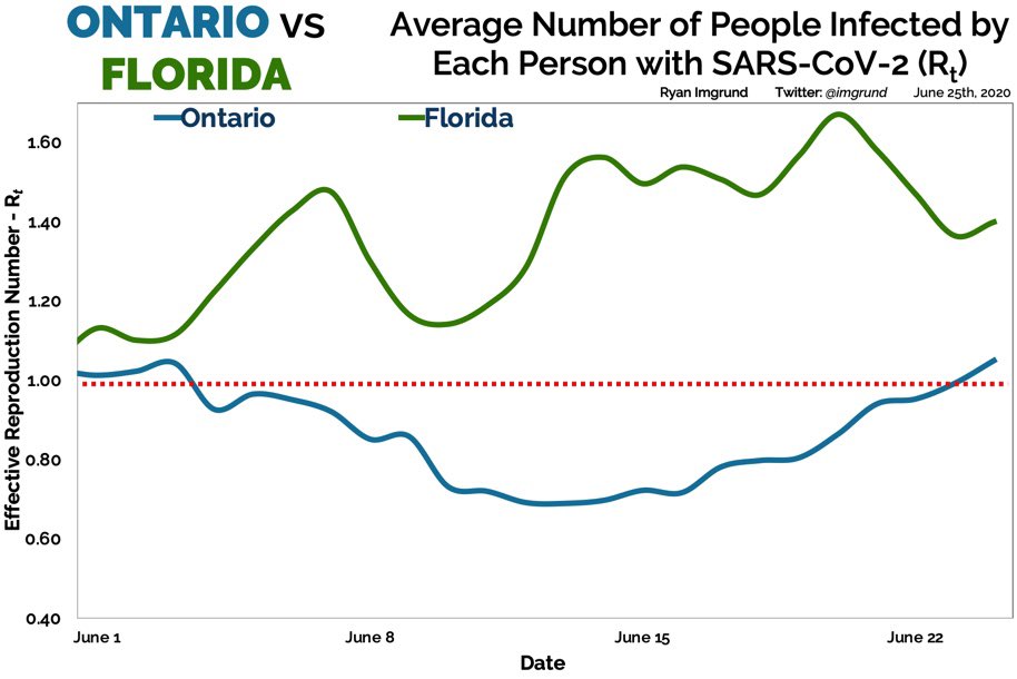
Florida’s Rt has averaged 1.38 in June; Ontario’s sits at 0.86.
A relatively small difference, right?
Well to TODAY: Florida released 5,511 cases; Ontario released 189.
Now let’s look at the CASES and Rt on one graph.
KEEP READING
...5/6 @DFisman
A relatively small difference, right?
Well
 to TODAY: Florida released 5,511 cases; Ontario released 189.
Now let’s look at the CASES and Rt on one graph.

KEEP READING
...5/6 @DFisman

 Read on Twitter