"There is no relationship—visually or statistically—between school districts’ reopening decisions and their county’s new COVID-19 cases per capita," notes @BrookingsInst's @JonValant, using @educationweek data. http://ow.ly/Kc6430r1QgO
"In contrast, there is a strong relationship—visually and statistically—between districts’ reopening decisions and the county-level support for Trump in the 2016 election."
Note the limitations to the data being used (counties vs. districts, in person for all vs. in person available).
There's been LOTS of coverage about in-person classes being planned for areas with high infection rates. Much less widely noted has been that areas with low infection rates are staying remote-only.
For example, this otherwise admirable NYT story highlights the politics surrounding reopening in-person instruction but provides little information about the infection rates in some of the areas like NYC where in-person is being questioned or limited: https://www.nytimes.com/2020/07/29/us/teacher-union-school-reopening-coronavirus.html
It was the Times that was among the first to propose an infection rate standard for school re-opening decisions: https://www.nytimes.com/2020/07/14/us/coronavirus-schools-fall.html
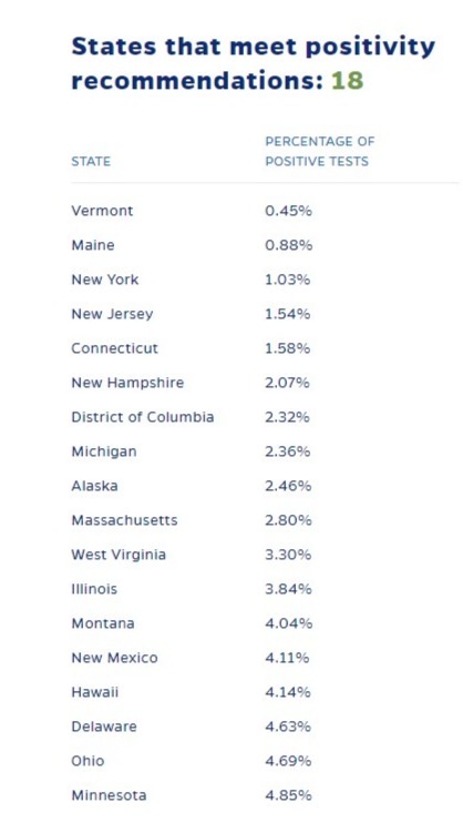
There are currently 18 states with positivity rates below 5 percent, the standard being used by the Johns Hopkins Coronavirus Resource Center http://ow.ly/EcyM30r1R2R .
What I haven't seen lately is a list of big districts by positivity rates, ideally side by side with their reopening plans, so we can see the relationships district by district.
Maybe @JohnsHopkinsSPH or @PoliticsK12 or @JonValant can help?
Maybe @JohnsHopkinsSPH or @PoliticsK12 or @JonValant can help?
This doctored version of EdWeek's School Districts' Reopening Plans: A Snapshot http://ow.ly/QKPe30r1RlR illustrates the key information that's missing in the reopening debate/coverage:

 Read on Twitter


