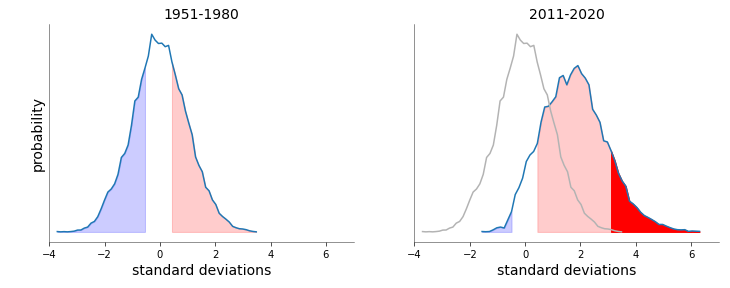
REPOST: I've been looking for a good figure showing Extreme temperatures have gone up. After searching without success, I made this, adapted from @DrJamesEHansen's 2012 PNAS paper. Data are from Berkeley earth.
[previous post had an error in the plot; corrected here]
[previous post had an error in the plot; corrected here]
The left plot shows the 1951-1980 June-July-August seasonal average for northern hemisphere land (30°N-60°N). The blue area is the coolest is 33% of temperatures, the white area or the middle 33%, and the red or the highest 33%.
The right plot shows the 2011-2020 temperatures. Over the decade, 88% of the seasonal averages would have been in the top third in the 1951-1980 period. Only 1.2% would have been in the coolest third. And 14% are warmer than ANY temperatures in the 1951-1980 period.

 Read on Twitter
![REPOST: I've been looking for a good figure showing Extreme temperatures have gone up. After searching without success, I made this, adapted from @DrJamesEHansen's 2012 PNAS paper. Data are from Berkeley earth.[previous post had an error in the plot; corrected here] REPOST: I've been looking for a good figure showing Extreme temperatures have gone up. After searching without success, I made this, adapted from @DrJamesEHansen's 2012 PNAS paper. Data are from Berkeley earth.[previous post had an error in the plot; corrected here]](https://pbs.twimg.com/media/EfzHqJmWAAcn_NG.png)


