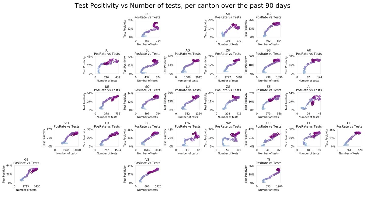
Where are all the Cantons going?
Test Positivity Rate vs Number of Tests, over the past 90 days, for each canton.
Ideal position in this chart: bottom, right (many tests, low Pos).
Also ok: bottom, middle (some tests, low Pos).
Colors indicates recency: heavy purple is now.
Test Positivity Rate vs Number of Tests, over the past 90 days, for each
 canton.
Ideal position in this chart: bottom, right (many tests, low Pos).
Also ok: bottom, middle (some tests, low Pos).
Colors indicates recency: heavy purple is now.
The above chart is a regional look into the approach by @marcrenfer, from the excellent thread below.
There he shows how the Test Positivity Rate, in relationship to the number of tests, has evolved and explains where it should be heading towards: https://twitter.com/marcrenfer/status/1318187205261774848
There he shows how the Test Positivity Rate, in relationship to the number of tests, has evolved and explains where it should be heading towards: https://twitter.com/marcrenfer/status/1318187205261774848
His more recent tweet shows optimism: the situation is evolving in the right direction, but is moving slowly.
The above regional chart should help pinpoint in which regions things are improving, deteriorating or stagnating. https://twitter.com/marcrenfer/status/1329735833184776192
The above regional chart should help pinpoint in which regions things are improving, deteriorating or stagnating. https://twitter.com/marcrenfer/status/1329735833184776192
PS: any feedback on my visualizations (readability, understandability, aesthetics, etc.) is welcome.

 Read on Twitter


