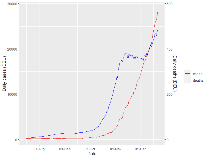
There is something rather inexorable about the relation between COVID-19 cases and deaths in the second wave. Here's a thread of the good and the (potentially very ) bad news. /1
 ) bad news. /1
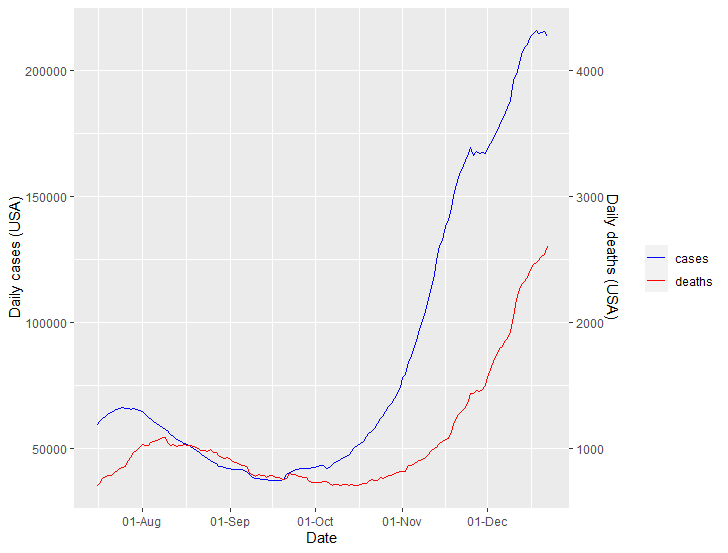
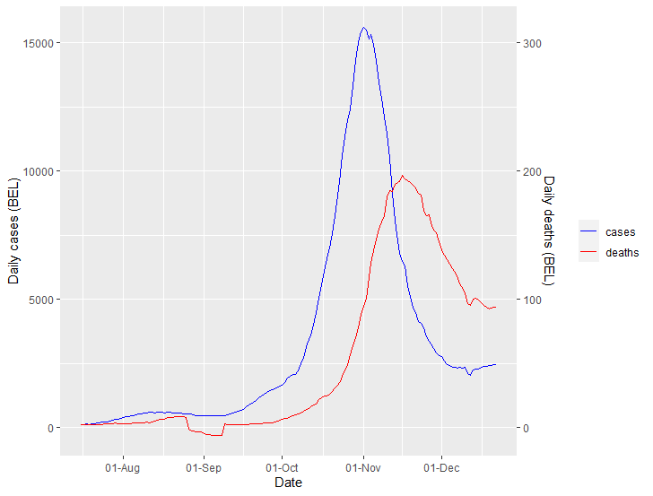
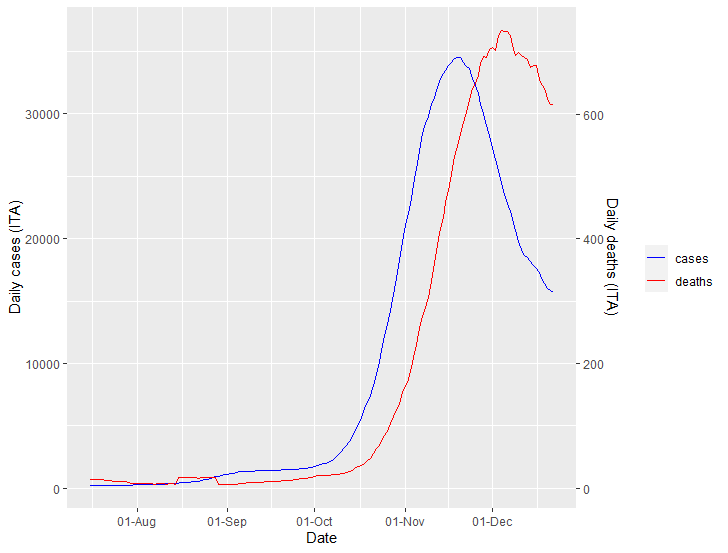
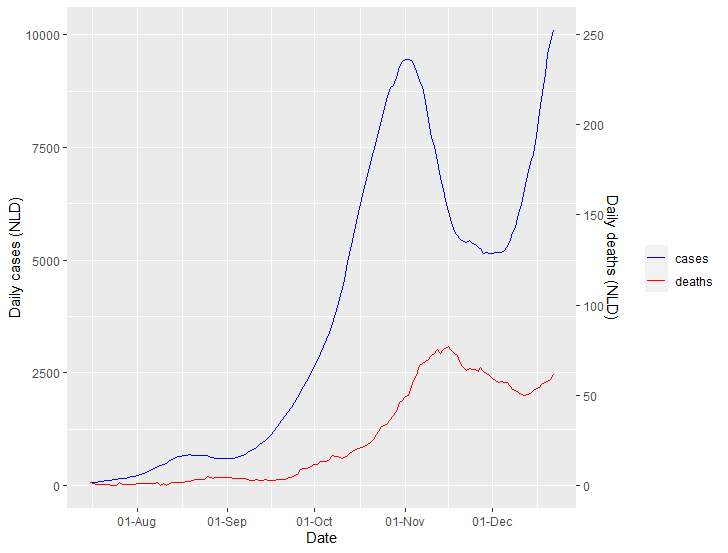
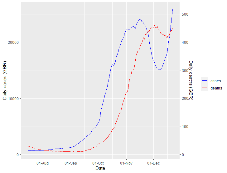
Basically, deaths follow cases remarkably closely, with between two and four weeks distance. The statistical modelling here is hard (don't use linear regression!), but a simply two-line plot is probably sufficient. /2
Italy has a long way to go, but they seem to have broken the back of the problem, if they can keep cases down. /4
It looks like the Netherlands may be starting to throw away the progress they made. (Their deaths-to-cases ratio is quite a bit lower than their neighbours'; I'm not sure why.) /9
Finally, the USA: The Thanksgiving effect may be just about plateauing out, but there is still the Christmas period to come. This is just awful. /12
All data from Johns Hopkins. I can make these charts very quickly if you would like to see how your country is doing in the second wave (or any other time period). /13 /end
cc @GidMK @jburnmurdoch
cc @GidMK @jburnmurdoch
PS: All data are 14-day moving averages.

 Read on Twitter
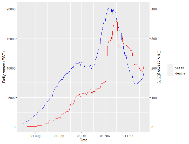
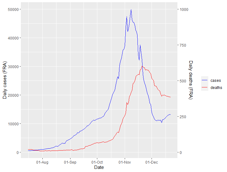
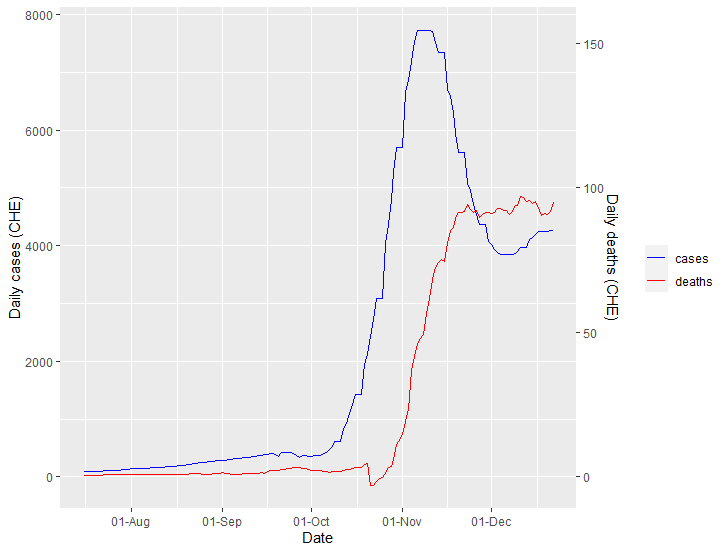
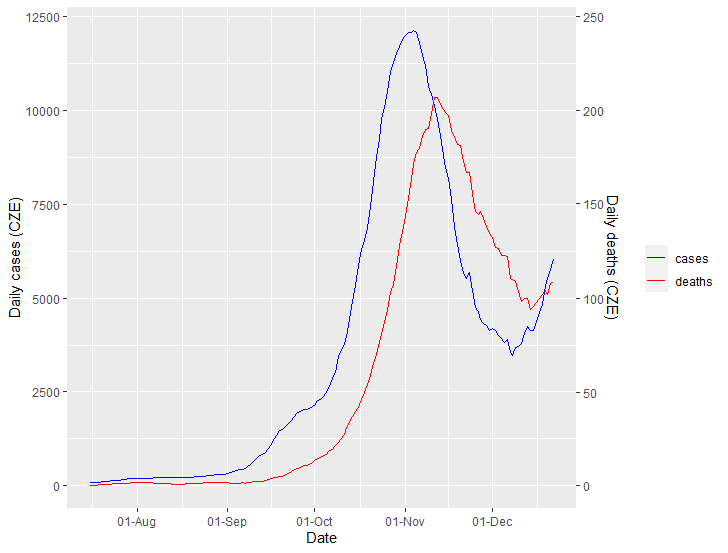
 /11
/11
