
 The "Math" of Fear
As it is Thursday, I have a post for you today in anticipation of Gov. DeWine's new Maps of Fear which he has tried to phase in. I have previously discussed both the new red and blue maps and their issues -
- but today I hope to illustrate even more clearly what level of manipulation is going on, particularly with the new blue 'ICU Utilization' map.
Attached I have two images.
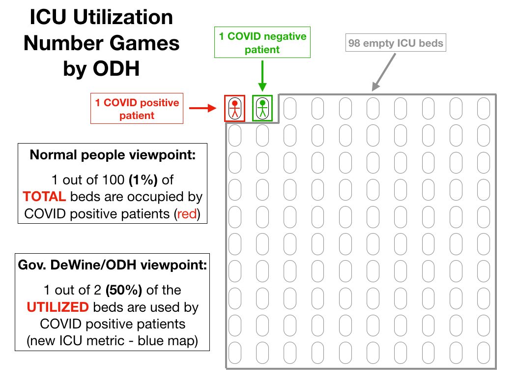
The first is a hyper-simplistic (and unrealistic) but illustrative example of the calculations that the new blue map goes through to arrive at its numbers.
The first is a hyper-simplistic (and unrealistic) but illustrative example of the calculations that the new blue map goes through to arrive at its numbers.
Instead of telling us the percent of beds occupied by COVID+ (not necessarily ill *with* COVID, but testing positive) - the governor and ODH only calculates the percentage of COVID+ out of just the *used* beds.
In the first image, I have an example of a 100 bed ICU with just two patients - one COVID positive (red) and one COVID negative (green). The other 98 beds are empty and able to accept new patients.
 Normal people would look at this situation and say that 1% of the beds in the ICU are being used by COVID positive patients.
But that's not how Gov. DeWine would present this situation to us. Instead of looking at the total available beds, they look only at the beds in use.
 In this example, there are only 2 beds *in use.* 1 of those is occupied by a COVID positive patient, making the 'ICU utilization' as defined by Gov. DeWine and ODH *50% instead of 1%.*
And if that green COVID neg patient were to be discharged and only the COVID positive patient remained, the COVID ICU utilization would be *100%* despite 99% of beds in the ICU still being available to accept patients. Now this is, again, a very extreme example and unrealistic.
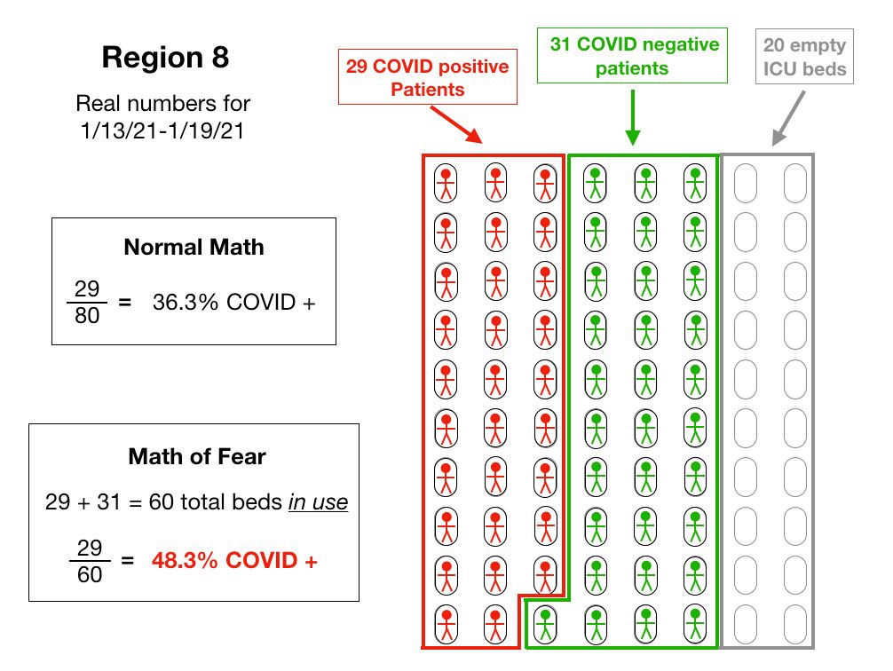
In the second image, however, I illustrate the same concept with the real numbers for Region 8 (southeast Ohio). Southeast Ohio has been called out week after week now for having very high 'ICU bed utilization,' but what does that mean in real numbers?
Over the (probable) 7 days that today's blue map will be made from, there was an average of ~80 total ICU beds in the region. On average, ~29 were occupied by COVID positive patients, and ~31 by COVID negative patients, with ~20 beds empty.
 For those of us using 'normal' math, we would say that 29 out of 80 beds are occupied by COVID positive patients, or 36.3%.
 But using Gov. DeWine's Math of Fear, our denominator is only 60 (29+31). Meaning that his equation becomes 29 out of 60 beds are occupied by COVID positive patients, or 48.3% instead of 36.3%!
 By manipulating the numbers, they have increased the real percentage by a third.
Not only does it artificially increase the apparent usage, it also creates perverse incentives (like so many of his metrics). The fewer non-COVID patients are using the ICU beds, the worse the COVID numbers look.
The worse the COVID numbers look, the more scared people will be to use the hospitals for those other procedures potentially leading to even lower non-COVID usage. Conversely, the more people using the ICU beds for other reasons, the *less used* it looks.
The games need to stop.
Note: For simplicity, I rounded the beds and the people to whole numbers so I wouldn't have to chop them in pieces for the illustration, so the specific % calculated here might be slightly off of what Gov. DeWine presents later today. But these are the real numbers for Region 8.

 Read on Twitter


