Tuesday's irrelevant musings (my opinion):
I don't really care about an esports organisation's branding.
All it does is create social media hubbub. Given the 'history' in esports, and ever-mentioned 'fragmented' fan base, it's almost an impossible task to please everyone.
I don't really care about an esports organisation's branding.
All it does is create social media hubbub. Given the 'history' in esports, and ever-mentioned 'fragmented' fan base, it's almost an impossible task to please everyone.
If you look at football clubs branding & their development over time - common themes are kept and 'modernised'. The common themes often have tie to historical, regional focal points. This is inherently absent in #esports given its digital nature.
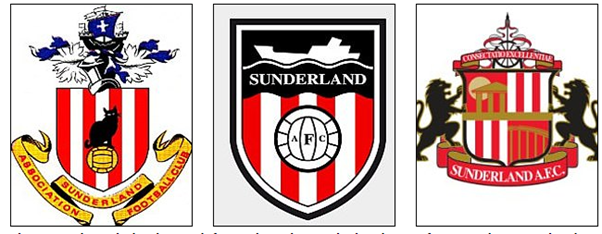
Take Sunderland - the initial crest had a black cat (the club's nickname) perched atop a football, with the town's coat of arms (an ancient ship coloured black to allude to the town's now bygone coal trade).
The crest from 73 onwards simplified but kept the ship (in black)
The crest from 73 onwards simplified but kept the ship (in black)
The current logo (after stadium move to Stadium of Light from Roker Park) takes influence from the Penshaw Monument (local landmark), the Wearmouth Bridge, a colliery wheel (reference to mining industry) - and two lions (from the town's coat of arms).
The attachment to a location, and thus implied heritage of said location makes it easy to draw on different influences and create a crest and brand given its history.
Esports completely lacks this - and thus what does an esport brand even mean?
Esports completely lacks this - and thus what does an esport brand even mean?
In my head when I think Fnatic, I think Olofmeister and the glory CS:GO era - the same with NiP.
Now Fnatic is arguably bigger in League of Legends, and a brand recognising history in CS:GO would be completely pointless.
Now Fnatic is arguably bigger in League of Legends, and a brand recognising history in CS:GO would be completely pointless.
Creating one brand that identifies and pleases everyone across 5+ different titles is (I would assume) a designer's nightmare, and it comes down to personal preference.
The current generation of #esports fans, if the hype's to be believed, will soon move on and new will emerge.
The current generation of #esports fans, if the hype's to be believed, will soon move on and new will emerge.
How many Arsenal fans remember or reminisce about the old logos? United? Newcastle? Watford? Leeds?
You have an attachment to what you grow up with. If NiP have another golden era in CS:GO with the current logo, it will become ‘iconic’ to a new generation.
You have an attachment to what you grow up with. If NiP have another golden era in CS:GO with the current logo, it will become ‘iconic’ to a new generation.
By changing your logo, you don’t suddenly lose the identity of a club. If you stop supporting a team because of a logo change, it goes to show the lack of loyalty that is intrinsic in esports.
With such a diverse audience, across titles, you’ll never have the perfect brand.
With such a diverse audience, across titles, you’ll never have the perfect brand.
NiP’s logo has taken a Chinese influence “Nin” meaning: “endurance, stealth, resistance, tolerance” and embedded it with the classic original shuriken.
This follows football transition – taking past influence and adding to it. If only it was Latin like the olden days...
This follows football transition – taking past influence and adding to it. If only it was Latin like the olden days...
I don’t care what teams do with their logos, but this follows convention and adds something extra to an existing brand.
Esports teams need to remember that a lot of fans still follow for players, and no matter your logo, you’ll lose/gain fans on players/performance alone.
Esports teams need to remember that a lot of fans still follow for players, and no matter your logo, you’ll lose/gain fans on players/performance alone.

 Read on Twitter


