I’ve spent some time this week looking at the data on lockdown. Are people staying at home? And if not, why not?
I've got hold of some new data which presents a different point of view
But first, here’s a story about household electricity usage during a pandemic
I've got hold of some new data which presents a different point of view
But first, here’s a story about household electricity usage during a pandemic
This chart shows household electricity usage by hour. It's collected by energy supplier @BulbUK from their network of tens of thousands of smart meters
It compares the last week of January 2020 and 2021
The silver lining of the pandemic: we're getting more sleep
It compares the last week of January 2020 and 2021
The silver lining of the pandemic: we're getting more sleep
The new pattern of the pandemic day is interesting. The old daytime peak of electricity usage was between 7.30 and 8.00
Now people rise later, then gradually use more electricity until lunchtime, which is the new peak before the big evening surge
(This is weekdays only btw)
Now people rise later, then gradually use more electricity until lunchtime, which is the new peak before the big evening surge
(This is weekdays only btw)
Why am I telling you this? Because we can use this data to see whether people are staying in during lockdown
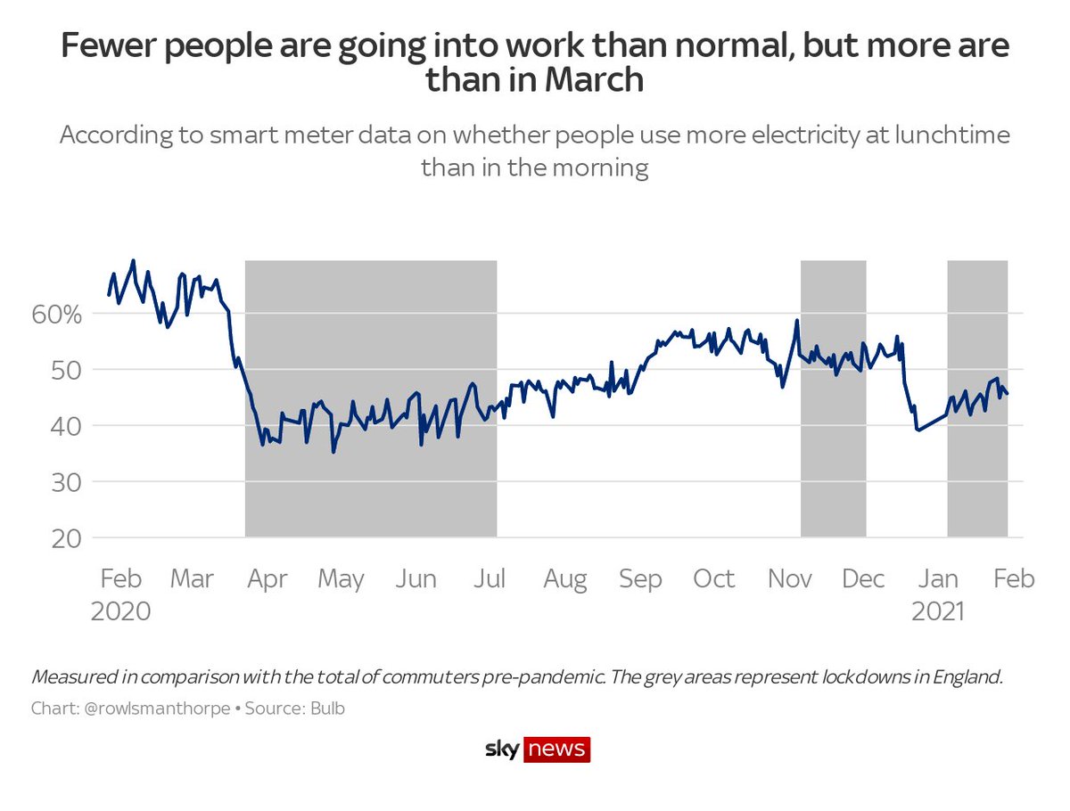
This chart shows all the households who use more energy at lunchtime than they use in the morning
... just as you would if you were going to work
This chart shows all the households who use more energy at lunchtime than they use in the morning
... just as you would if you were going to work
I should pause here to stress that this isn't my analysis. Full credit goes to @dpmcna of Bulb's data science team
It's not a perfect picture of individual movement, obviously, but it's a brilliant heuristic for looking at behaviour
It's not a perfect picture of individual movement, obviously, but it's a brilliant heuristic for looking at behaviour
Anyway, here's that chart again (this time with the right title, thanks @VictimOfMaths). A few things jump out to me
1. People listened when the PM said “go back to work if you can”
2. Lockdown 2 had little impact on workers
3. Lockdown 3 is between lockdowns 1 and 2 in strength
1. People listened when the PM said “go back to work if you can”
2. Lockdown 2 had little impact on workers
3. Lockdown 3 is between lockdowns 1 and 2 in strength
The ineffectiveness of lockdown 2 is also what Paul Hunter of UEA pointed out when I asked him what he found interesting. He pointed out the connection between school closures and working from home
Something to think about here
Something to think about here
But you’re not here for pandemic history, you want to know what’s happening now.
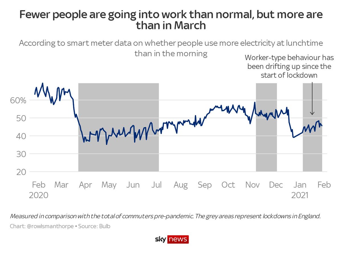
Well, take a look at the right side of this chart
By this measure – just one measure, numerous limitations etc – lockdown is losing its grip on the working population
Well, take a look at the right side of this chart
By this measure – just one measure, numerous limitations etc – lockdown is losing its grip on the working population
You might be thinking, well, if lockdown is weaker, why are cases and hospital admissions going down?
Or you might be thinking, now this explains why the ONS is so high
I don’t know what the reality is, but this finding sides with ONS (absent from today’s briefing, I note)
Or you might be thinking, now this explains why the ONS is so high
I don’t know what the reality is, but this finding sides with ONS (absent from today’s briefing, I note)
FWIW, my theory about the ONS/testing discrepancy is that younger people, who are less likely show up in hospital stats, aren’t getting tested. This energy data might suggest they are avoiding tests to go to work. But it’s tenuous, I admit
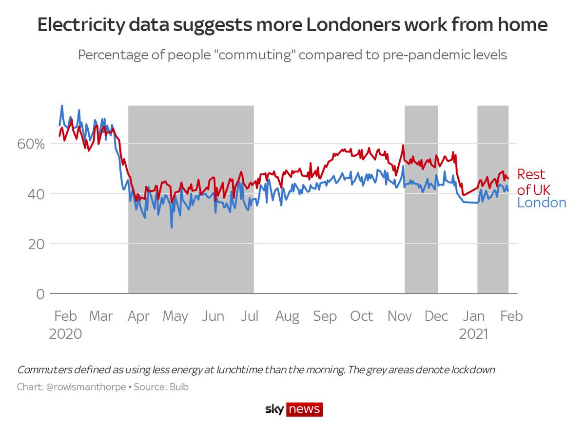
I do think there is some connection between increased worker movement and increased cases, because of the electricity data in London
Significantly more people work from home in London (presumably because of the nature of the work there)
Significantly more people work from home in London (presumably because of the nature of the work there)
This ties in with the idea of a London effect, as the piece below describes. It doesn’t explain everything, as London has been hit hard in both waves. But it does suggest some level of extra protection, most notably in September under the tier system https://www.theguardian.com/commentisfree/2020/sep/14/working-from-home-covid-19-london-uk-capital-white-collar-work
Lost my thread so I'm sewing these together https://twitter.com/rowlsmanthorpe/status/1357084220087230465

 Read on Twitter


