* Relative Strength Thread *
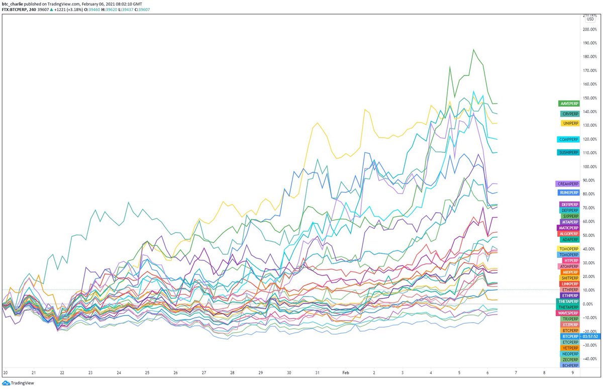
Let me explain the spaghetti and how I use it to trade $ALTS.
This chart shows the net difference in return of certain alts vs. the BTC $ price.
For the time period selected, $AAVE would have given you the best return.
Let me explain the spaghetti and how I use it to trade $ALTS.
This chart shows the net difference in return of certain alts vs. the BTC $ price.
For the time period selected, $AAVE would have given you the best return.
"That's great hindsight Charlie, + twitter points. But how does that help me trade?"
Well, it actually tells you what I imagine you already know - DeFi is one of the highest returning investments over the same period if you look at the top 5. So this is where you want to be.
Well, it actually tells you what I imagine you already know - DeFi is one of the highest returning investments over the same period if you look at the top 5. So this is where you want to be.
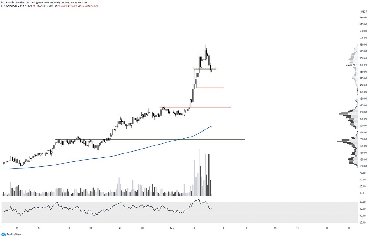
Instead of panicking about this pullback, mark some areas of interest to you.
E.g. the $AAVE chart. Some areas for me are below.
Now that doesn't mean blind bid. It means where am I looking for a reversal and sign of strength; typically (for me) on lower timeframes.
E.g. the $AAVE chart. Some areas for me are below.
Now that doesn't mean blind bid. It means where am I looking for a reversal and sign of strength; typically (for me) on lower timeframes.
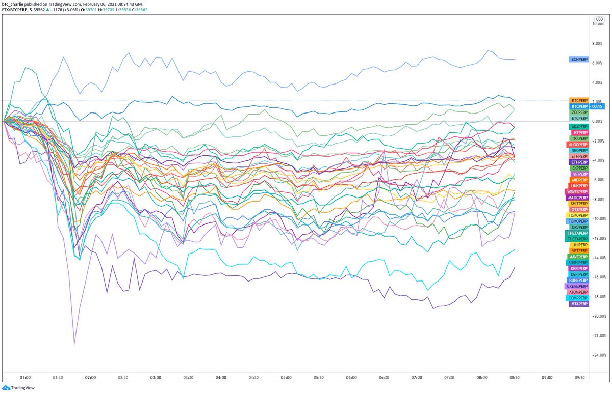
That's where this comes in - the same chart but on a 5 minute timeframe.
I guess the question I see is "Where is the money flowing?" "What are people buying?".
The way this looks it's suggesting BTC is leading (ignore the scam that is BCH).
Good for ALTS? No, not short term.
I guess the question I see is "Where is the money flowing?" "What are people buying?".
The way this looks it's suggesting BTC is leading (ignore the scam that is BCH).
Good for ALTS? No, not short term.
If you combine that with how BTC looks, imo you have a recipe for the next BTC leg up.
I tend to ignore the BTC.D chart because it's a TERRIBLE metric and calculation, but if you were treating it as a stand alone chart that wick looks like capitulation/reversal.
I tend to ignore the BTC.D chart because it's a TERRIBLE metric and calculation, but if you were treating it as a stand alone chart that wick looks like capitulation/reversal.
So all of this considered - how does that effect the plan?
Well I've moved my collateral to BTC for a start. I'll eye LTF reversals on major DeFi alts; BUT I will be quicker cutting these positions and will have an eye on BTC at all times (particularly spot volume).
Well I've moved my collateral to BTC for a start. I'll eye LTF reversals on major DeFi alts; BUT I will be quicker cutting these positions and will have an eye on BTC at all times (particularly spot volume).
All in all, you do you friend, and however you trade (strength, PA, moon cycles, etc.) all that matters is it makes sense to you.
Hope that gives you a view into my trading and spaghetti charts.
If you enjoyed it give it a like/RT - and if you have any questions let me know
Hope that gives you a view into my trading and spaghetti charts.
If you enjoyed it give it a like/RT - and if you have any questions let me know

p.s. I do not enter a trade solely off the spaghetti - it just helps me know what to look at and when.
I enter trades off PA - key levels, RSI divergences, volume/breakout plays etc. and a few fractal setups (like the giraffe). This just helps me know where to look and when.

I enter trades off PA - key levels, RSI divergences, volume/breakout plays etc. and a few fractal setups (like the giraffe). This just helps me know where to look and when.


 Read on Twitter


